
Negative Delights
BRAND IDENTITY
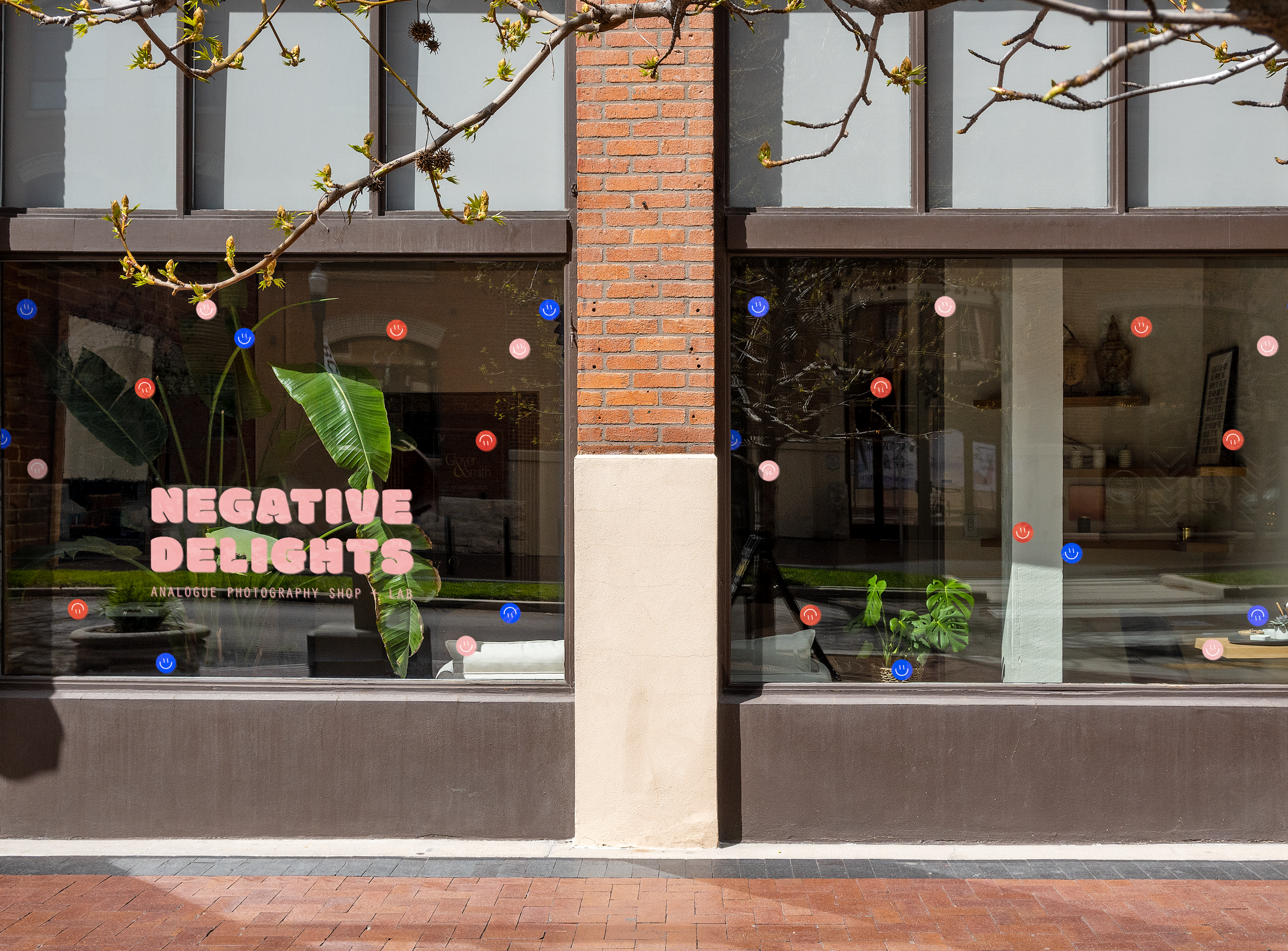
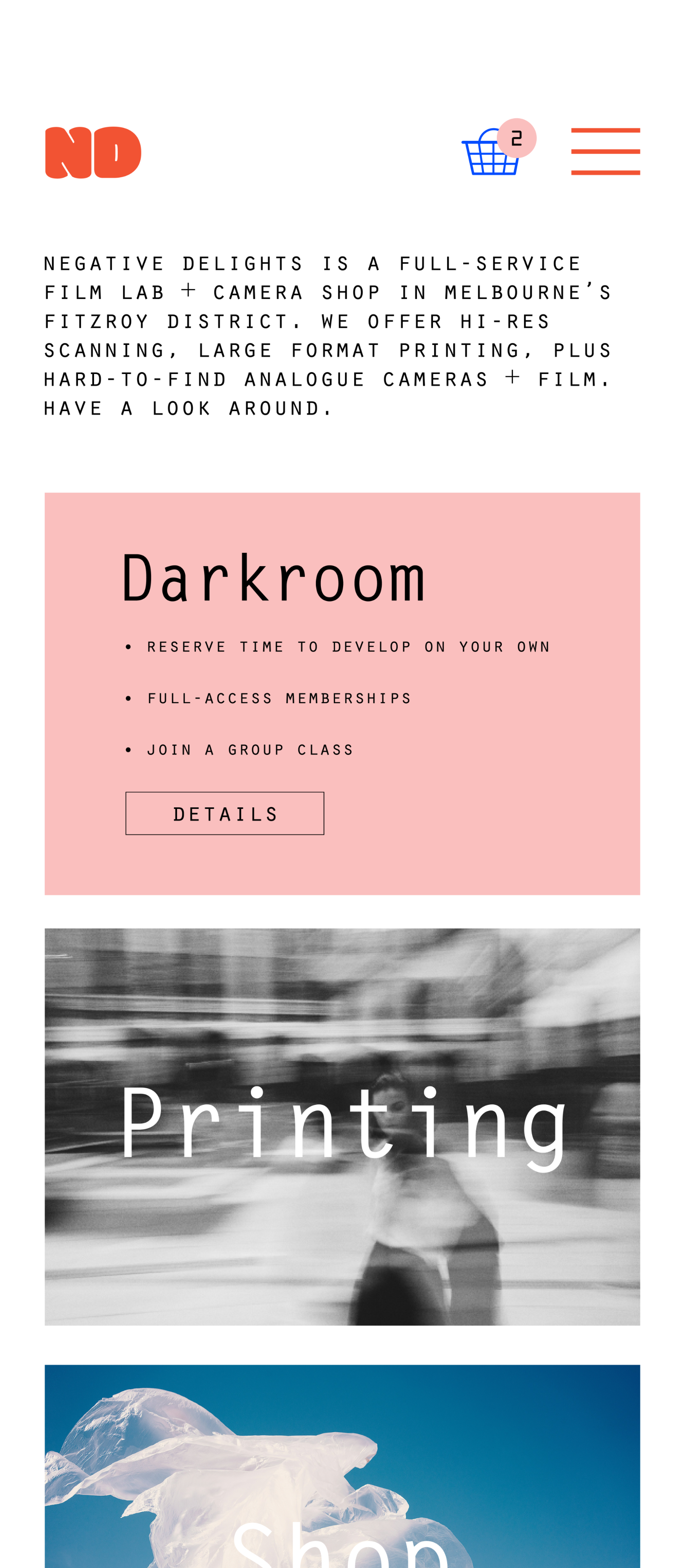
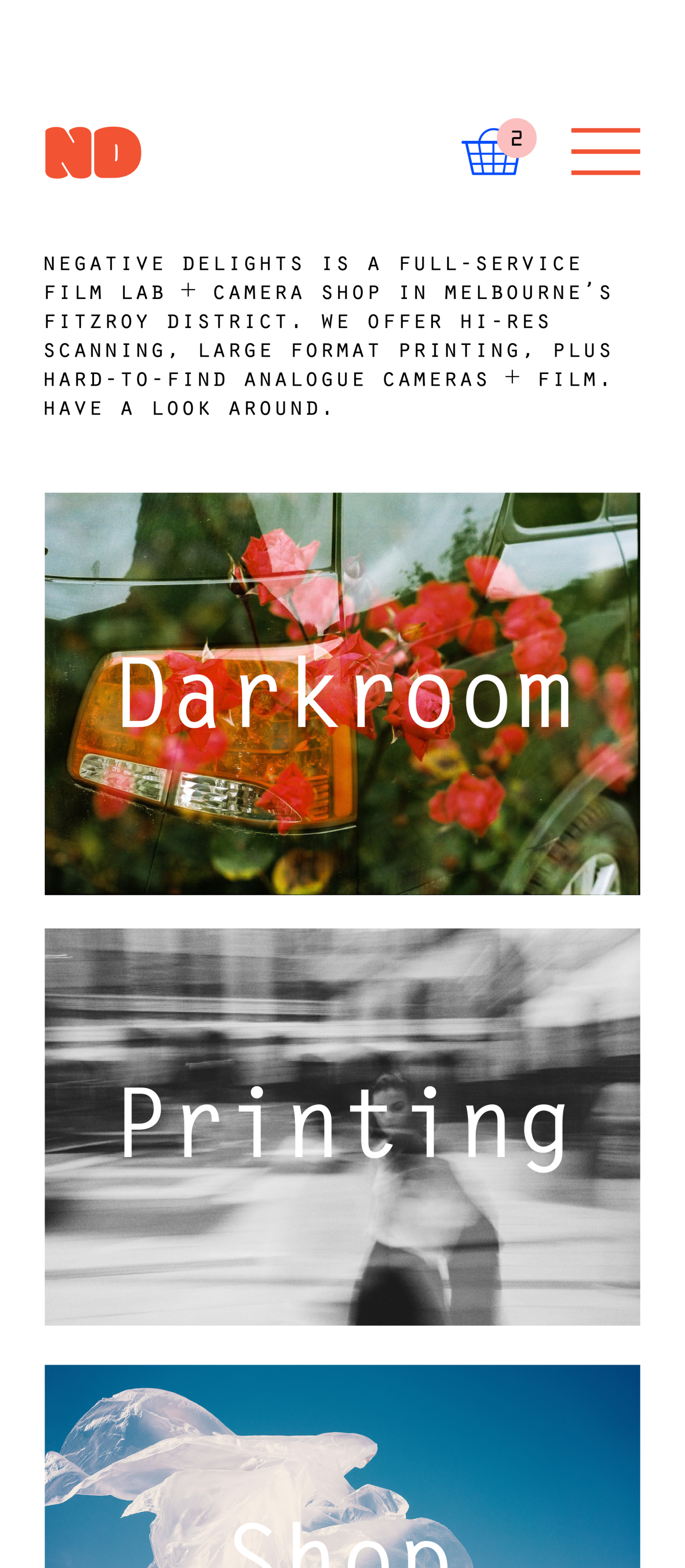
A new film lab + camera shop in Melbourne’s eclectic Fitzroy neighborhood by industry vet Virginia Reed.
Known for her community organizing and hospitality, Virginia is a fixture at every neighborhood function. To celebrate her dedication to Fitzroy, a brand identity was created in honor of the neighborhood itself. She hopes her new business will attract familiar faces, particularly those who would otherwise be intimidated by analog photography.
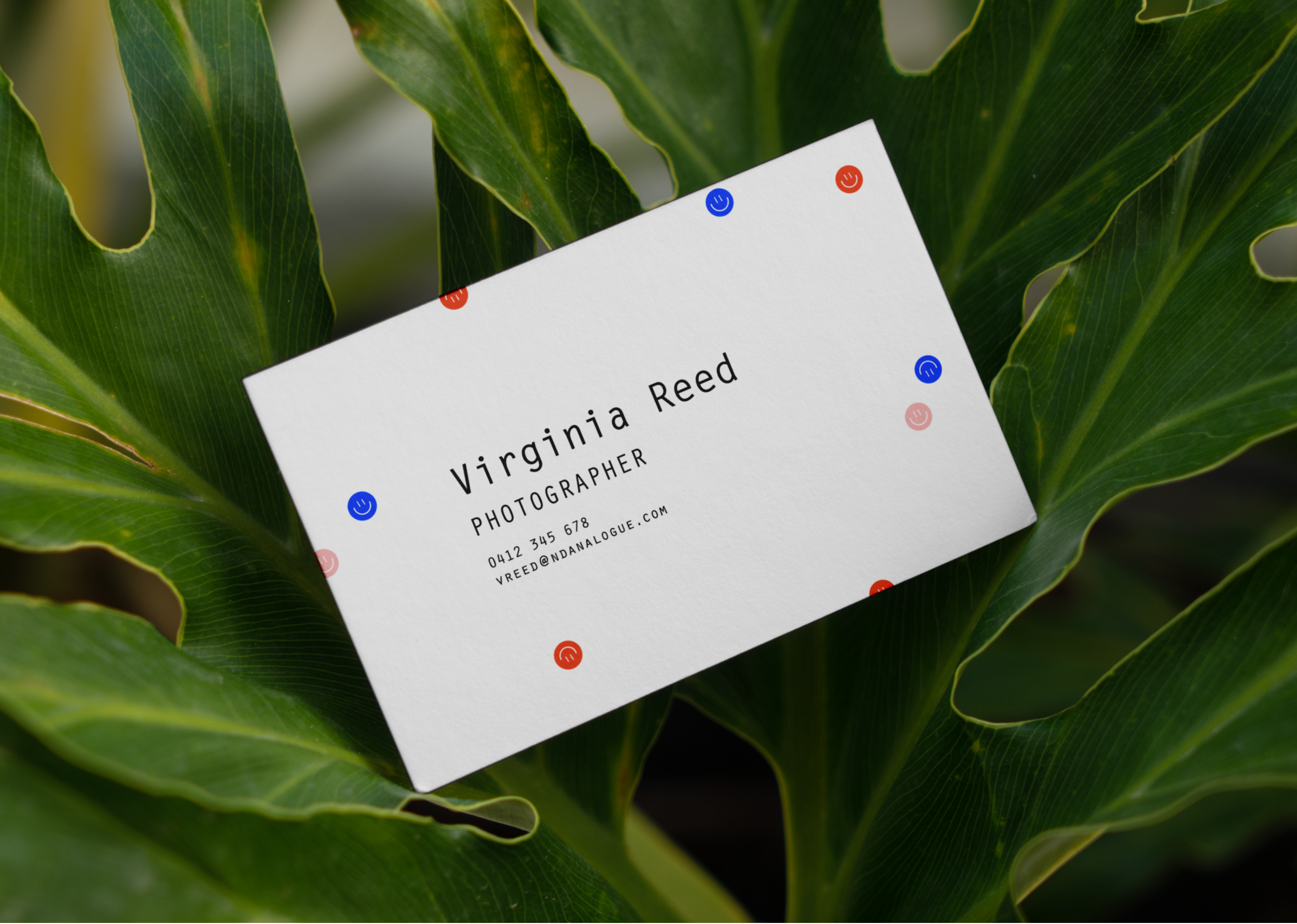
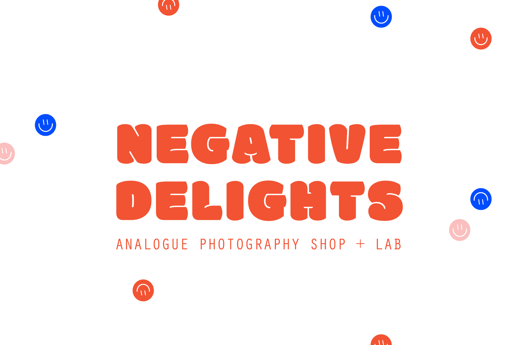
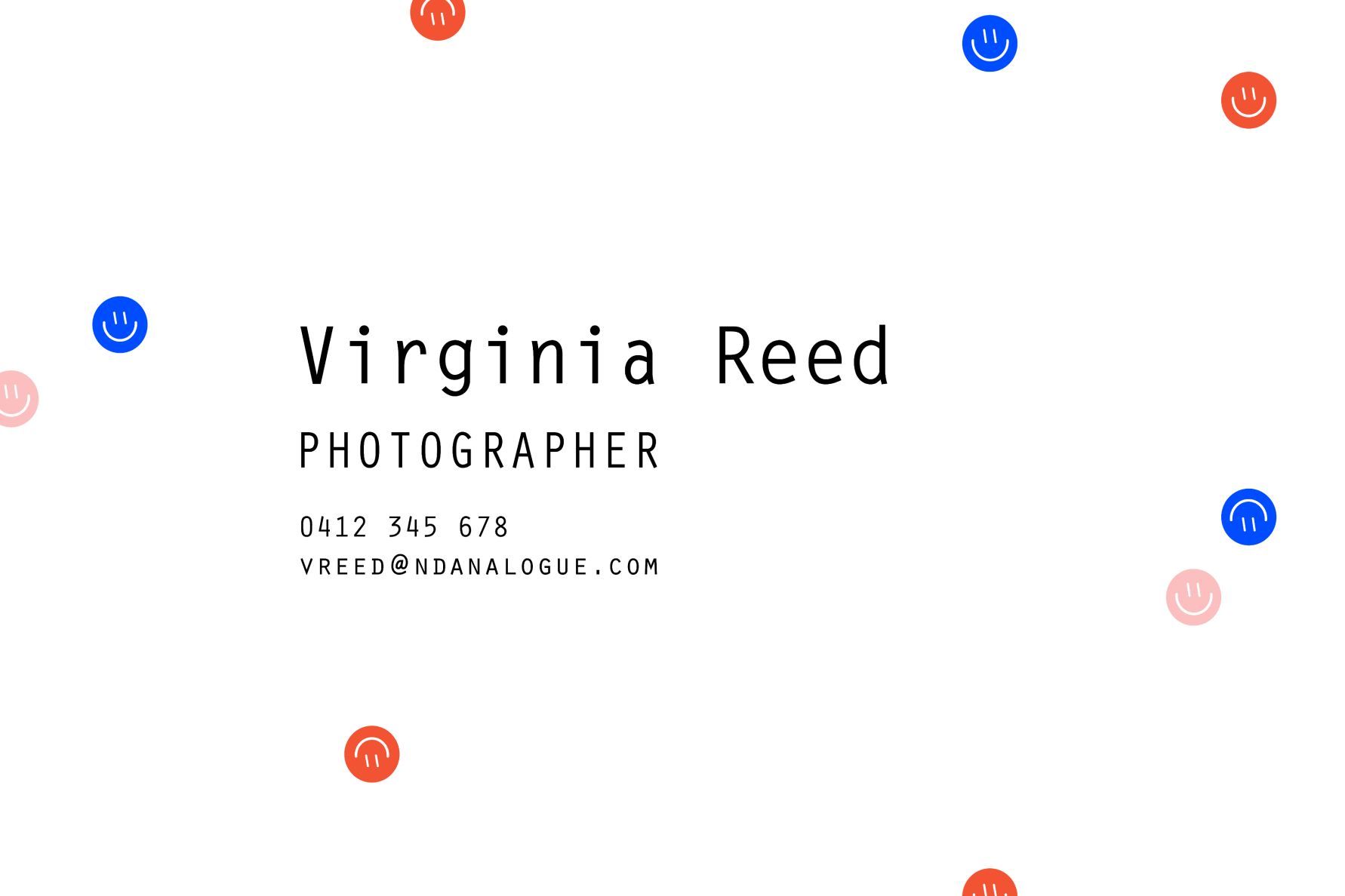
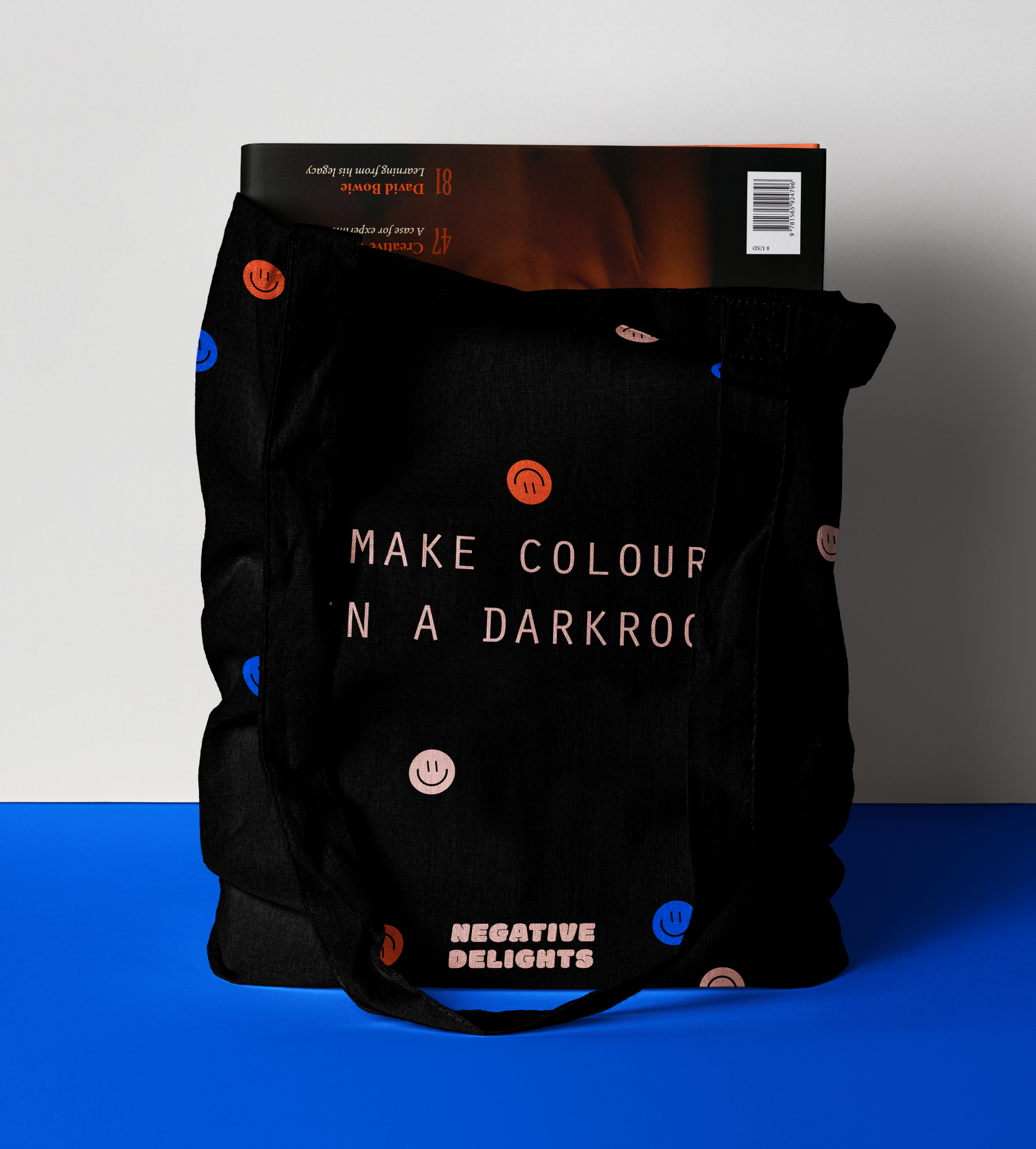
Negative Delights’ visual identity is inspired by the neighborhood’s harmonious juxtaposition of aesthetics, where graffiti and Victorian-era architecture co-exist. A plump, cheerful typeface alongside a stoic, mono-spaced one make for an unexpected pair. To further celebrate friendly opposites, blue and pink (classic, if not outdated, gendered colors) strike the perfect balance.

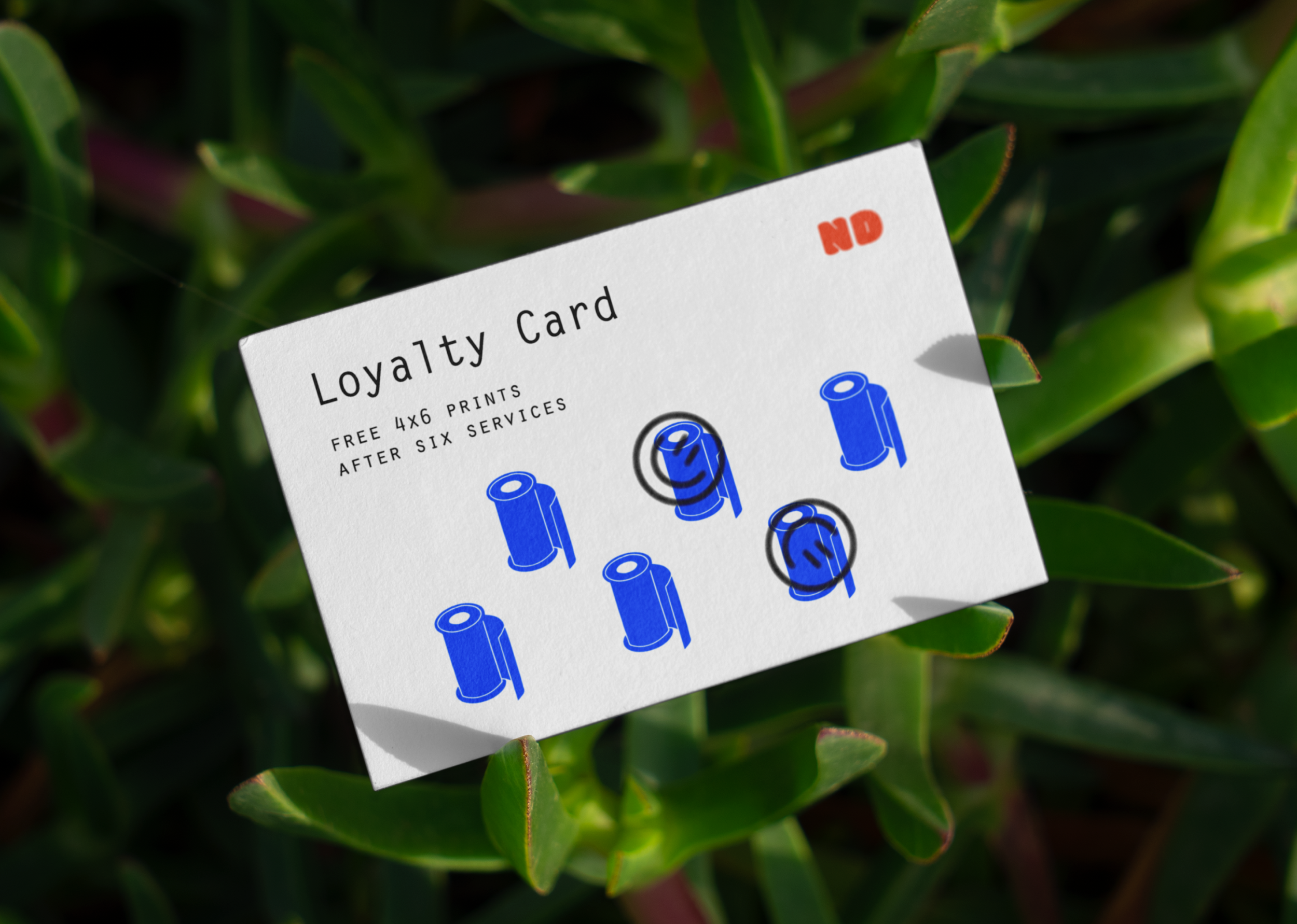
To celebrate film photography, without being too literal, the circles represent contrast filters, with the red color representing the safelight of a darkroom. The rotating smiley faces (and store name) embody the happy accidents synonymous with film photography.
Student concept project